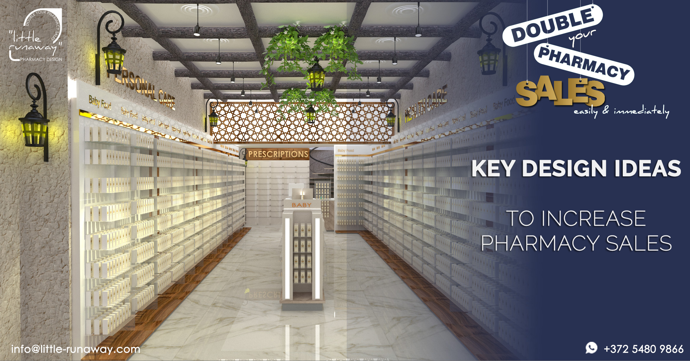
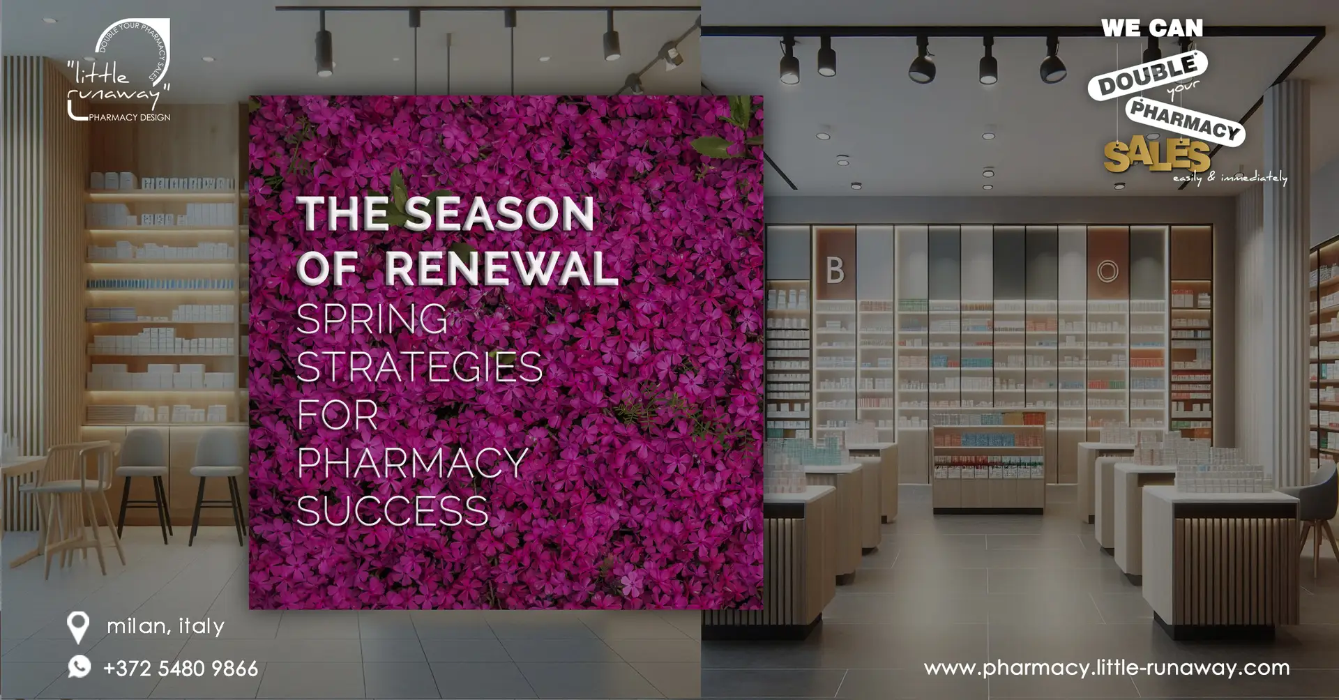
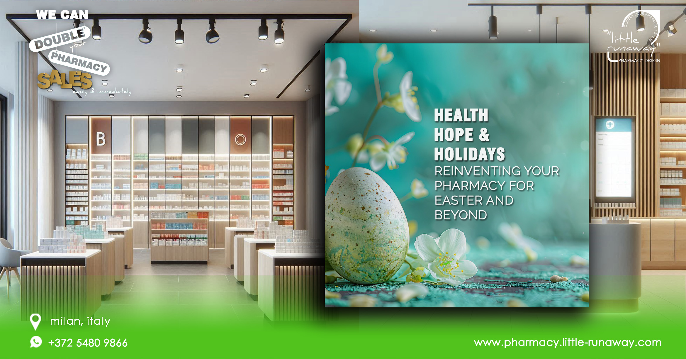
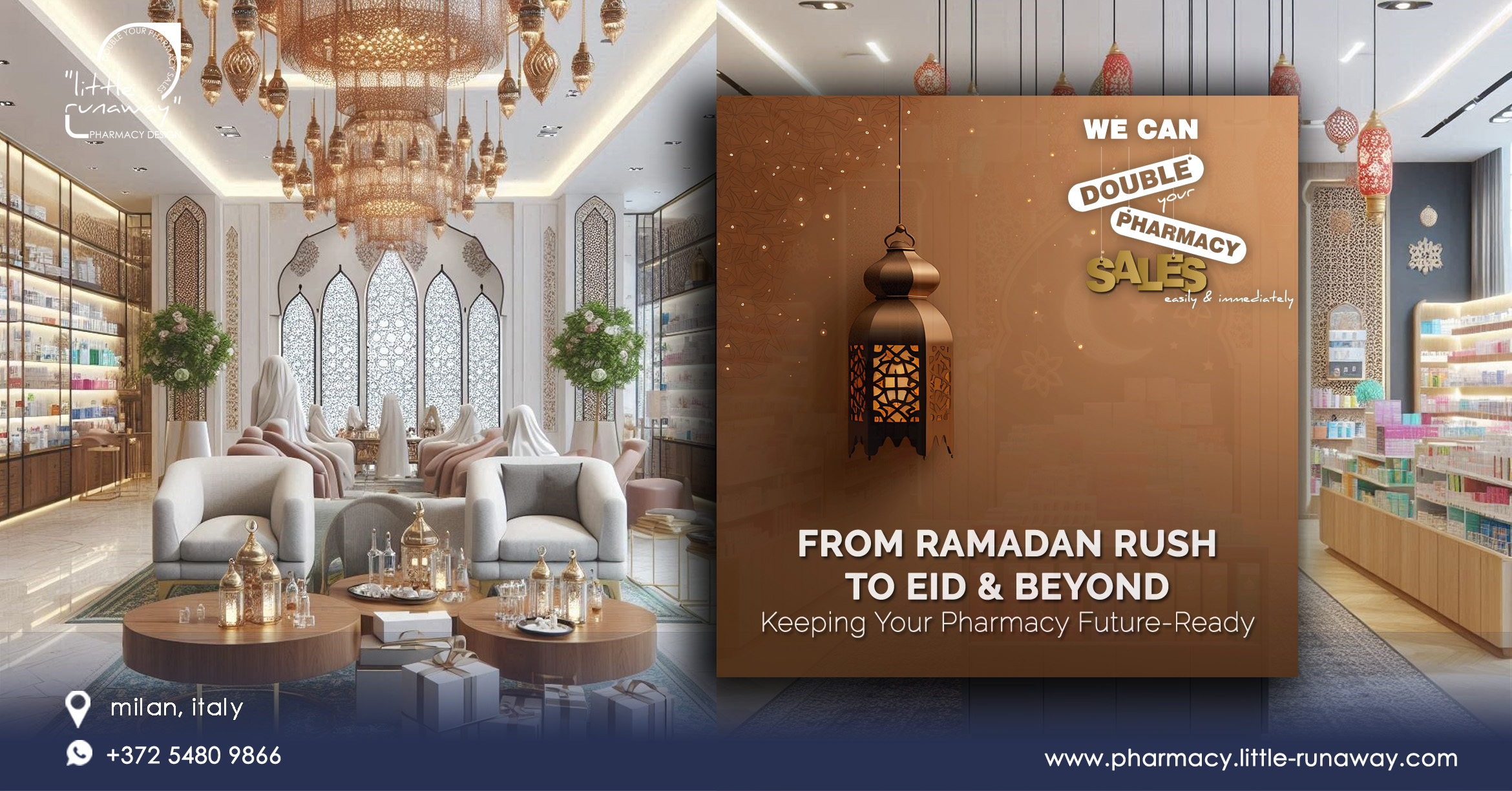
Designing an effective design layout for a pharmacy can significantly impact sales by enhancing customer experience inside your pharmacy, promoting products, and encouraging impulse purchases. At Little Runaway Pharmacy design, we consider all these aspects and features to design a successful pharmacy that can sell more easily and immediately and here you can see some key ideas to increase your pharmacy sales.
AT LITTLE RUNAWAY..we design pharmacies to create optimal retail space and thereby helping you to maximise the sales and improve customer satisfaction. Our services enables you to increase returns from your two biggest investments – Pharmacy space and products.
WE CAN HELP YOU GET MORE CUSTOMERS.
1. INVITING ENTRANCE AREA:
– Create an appealing, well-lit, easily accessible and inviting entrance with clear signage that highlights key services, and promotions and make sure the position of the pharmacy counter is visible from the entrance.
– This allows customers to easily locate it for prescription pickup or consultation, while also increasing exposure to other products on their way to the counter.
– Use thematic decorations and props to create an immersive environment that resonates with customers.
2. COMFORTABLE SHOPPING ENVIRONMENT:
– Design a logical, intuitive and easy-to-navigate pharmacy layout that guides customers through different sections of your pharmacy.
– Use Shopping pathways to encourage exploration and allow customers to easily navigate the pharmacy. Consider different options like grid, loop, or free-flow layouts based on your pharmacy size and merchandise.
– Keep the aisles wide, clutter-free, and well-organised and ensure there is ample space for customers to move freely.
– Maintain a clean, well-ventilated and well-lit pharmacy with a pleasant atmosphere to make customers feel comfortable and encourage them to spend more time browsing.
– Use clear signage to guide customers to different sections, such as cold and flu remedies, pain relief, skincare, baby products, etc.
– Play appropriate background music that aligns with your brand, enhances the ambience and creates a positive shopping experience.
– Create a comfortable seating space for customers in need either for prescriptions or consultations, It can be as simple as a small chair but the impact on the people who needs them is high. Provide reading materials or informative brochures about health and wellness topics.
– A small kids’ play table or a board can also give a peaceful and enjoyable shopping experience to the parents
DID YOU KNOW.?
Shopping area of the pharmacy should contribute much to the overall vitality and interest of your city / community and help to make them attractive to residents and visitors alike. There is a close relationship between environmental quality and the success of your pharmacy. An attractive shopfront can convey an impression of good taste and quality environment; this is reflected in retail turnovers and commercial success whereas Poor-quality shopping environments experience a downward spiral of lack of confidence and investment and, ultimately, a lack of trade.
3. ENGAGING VISUAL MERCHANDISING:
– Use themes, colour coordination, attractive displays and appealing signage to draw attention and showcase products in a visually appealing way that tells a story of your pharmacy and highlights your health and wellness products.
– Use clear and informative signage throughout the pharmacy to guide customers to different sections and use digital displays to highlight promotions, and provide product details, health tips, or special offers.
– Include directional signs and aisle markers to make it easy for customers to find what they’re looking for and ensure that signage is visible from various angles and distances.
– Implementing proper lighting to enhance product visibility and create a welcoming atmosphere and incorporating technology can enhance the shopping experience and provide valuable information to customers.
If you create a caring atmosphere in your community and personalise your services for every valuable individual in your community, then, you will be rewarded with customer loyalty.
You have tried your way and you didn’t get into success,
WHY DON’T YOU TRY OUR WAY?
Simplicity in using the latest technology for everyday needs has transformed human shopping behaviours.
How you can simplify shopping in your Pharmacy.?
We are here to help you and to improve footfall in your pharmacy..!
at little runaway,
we design your pharmacy to create optimal retail space and thereby help you to maximise sales and improve customer satisfaction.
WE CAN DOUBLE YOUR PHARMACY SALES EASILY & IMMEDIATELY.

✑ Contact us now
✑ Develop your own pharmacy
✑ Customise your business growth plan, sales and marketing systems
✑ Expand your business growth and opportunities.
Share this with your friend
- Click to share on Facebook (Opens in new window) Facebook
- Click to share on WhatsApp (Opens in new window) WhatsApp
- Click to email a link to a friend (Opens in new window) Email
- Click to print (Opens in new window) Print
- Click to share on LinkedIn (Opens in new window) LinkedIn
- Click to share on X (Opens in new window) X
- More


