The Importance of Colours in Retail Community Pharmacy

Little Runaway Pharmacy Design, Visual Merchandising.
In a pharmacy business, where first impressions are paramount, the role of colour cannot be overstated. Visual merchandising plays a critical role in the success of pharmacies, influencing customer perception, behaviour, and purchasing decisions. One of the most powerful tools in visual merchandising is colour. From logos and packaging to marketing materials and store design, colour plays a pivotal role in shaping a brand’s identity and influencing consumer perceptions. The strategic use of colour can transform the in-store experience, enhance product visibility, and ultimately drive sales. In this guide, we’ll explore the importance of colour in pharmacies and how it can be leveraged effectively to create impactful displays and maximize customer engagement.

When you step into a pharmacy, have you ever noticed how the colours surrounding you affect your mood and perception of the space?

Colours play a significant role in shaping the ambience of a pharmacy, influencing customers’ emotions, behaviours, and overall shopping experience.

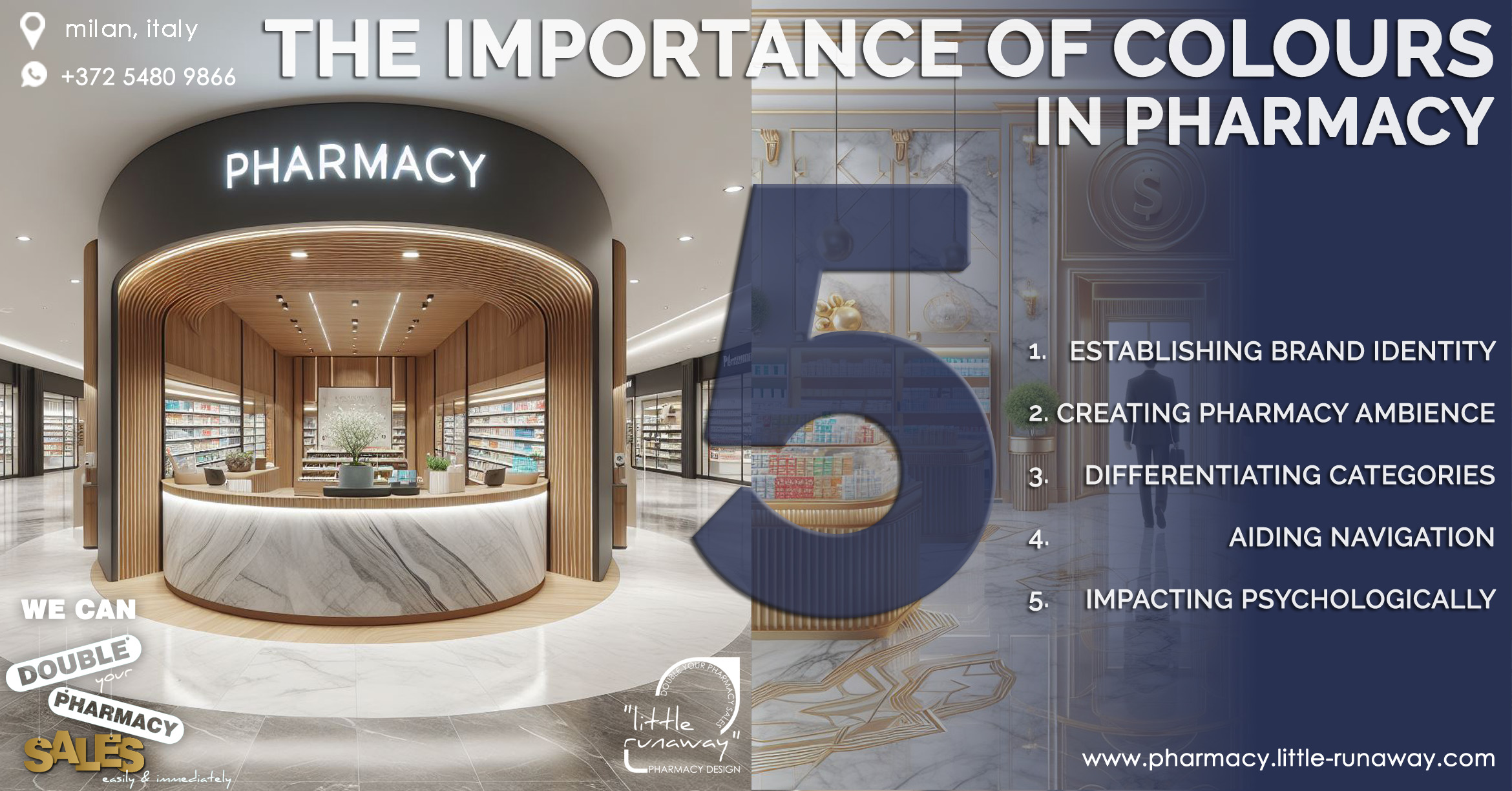
1. Establishing Brand Identity

The cornerstone of brand identity is colour, instantly recognizable and synonymous with the essence of a brand. Consider the iconic golden arches of McDonald’s or the vibrant red of Coca-Cola; these colours have become inseparable from their respective brands, evoking immediate recognition and association. Every colour carries its own psychological connotations, allowing brands to communicate specific traits, emotions and personalities. For instance, blue conveys trust and professionalism, making it a popular choice for healthcare providers, including pharmacies. In contrast, vibrant hues like orange and yellow exude energy and optimism, ideal for youthful and dynamic brands. A cohesive colour scheme reinforces brand recognition and strengthens brand recall, making it easier for consumers to identify and engage with the pharmacy amidst a sea of competitors, standing out from the competition is essential for brand survival and consistent usage of colours and typography across various touchpoints like signage, packaging, and marketing materials reinforces brand recognition and fosters a cohesive brand experience.
Strategic use of colour can help pharmacies differentiate themselves from competitors and carve out a distinct identity. By choosing unique colour combinations and palettes, pharmacy brands can capture attention and leave a lasting impression on consumers. Visual brand elements such as logos, colour schemes, typography, and imagery are instrumental in conveying the pharmacy’s identity. A well-designed logo serves as a visual anchor for the brand, instantly recognizable and synonymous with its values and offerings.
As market dynamics shift and customer expectations evolve, pharmacies must adapt their branding strategies to remain relevant. Regularly evaluating brand performance, soliciting customer feedback, and staying attuned to industry trends allow pharmacies to refine their brand identity and ensure continued resonance with their target audience.

The way we run the pharmacy is changing, Is your pharmacy ready to face the future?  

Merchandising goes beyond simply stocking shelves; it involves a strategic approach to product placement, visual appeal, and creating an environment that resonates with the needs and preferences of the clientele.

We can help your pharmacy.!

2. Creating Pharmacy Ambiance

When you step into a pharmacy, have you ever noticed how the colours surrounding you affect your mood and perception of the space? Colours play a significant role in shaping the ambience of a pharmacy, influencing customers’ emotions, behaviours, and overall shopping experience. Let’s explore how colours are strategically utilized to create a welcoming and conducive environment within a pharmacy setting.
Creating a visual hierarchy within the store layout can be used to guide customers’ attention and to direct their focus to key areas or products. Colours must be universally appealing and has the ability to evoke positive emotions.
Neutral tones such as beige, taupe, or soft grey can be used as the foundation for interior decor, providing a neutral backdrop that complements other accent colours. Soft, soothing colours like light blue, green, and pastel shades can evoke feelings of relaxation, calmness, a Sense of comfort and tranquillity, especially for those seeking medical assistance or advice.  These colours help reduce stress and anxiety, creating a more comfortable environment for customers and promoting a sense of trust and reassurance.
Bright, eye-catching colours can be strategically placed to draw customers’ attention to featured products or promotions, while more subdued colours can be used for background elements to provide visual balance and contrast. By incorporating subtle pops of colour through decor accents, artwork, or seating areas, pharmacies create inviting spaces where customers feel valued and respected.
The use of natural and organic colour palettes, such as earth tones and botanical greens, can reinforce and emphasise the health and wellness priorities of a pharmacy and can create a sense of authenticity and credibility. These colours can be incorporated into signage, displays, and promotional materials to communicate a commitment to holistic health and well-being.

DID YOU KNOW.?

A question that pharmacists often ask is, whether the visual merchandising displays can be beneficial for their pharmacy to retain existing and to attract more new customers.?
The answer is Yes, the Visual Merchandising does a big deal of business in the way you use in your pharmacy, in this article we are giving you a short description of
What are the factors involved in Visual Merchandising?

Shopping area of the pharmacy should contribute much to the overall vitality and interest of your city / community and help to make them attractive to residents and visitors alike. There is a close relationship between environmental quality and the success of your pharmacy. An attractive shopfront can convey an impression of good taste and quality environment; this is reflected in retail turnovers and commercial success whereas Poor-quality shopping environments experience a downward spiral of lack of confidence and investment and, ultimately, a lack of trade.

3. Differentiating Categories

Colours are powerful tools for drawing attention to specific products or promotions within the pharmacy. From packaging to labelling to signage, colour plays a pivotal role in how products are perceived and aids customers in making informed purchasing decisions. Colour coding is commonly used in pharmacies to categorize products and create distinct identities for different product lines.
Colors can be used to convey important product attributes and characteristics. For instance, bright, vibrant colours may be used to signify freshness and vitality in vitamins and supplements, while muted, calming colours may be used to evoke a sense of relaxation in sleep aids or stress relief products. By aligning colour choices with product attributes, pharmacies can communicate value propositions more effectively to customers.
Colour plays a crucial role also in promoting seasonal and promotional items within the pharmacy. Bright, seasonal colours can draw attention to holiday-themed products or limited-time offers, encouraging impulse purchases. Additionally, using colour to differentiate promotional signage or displays helps these items stand out from regular inventory and creates a sense of urgency among customers.
Colour coding can be an effective way to differentiate product categories and streamline the shopping experience. By assigning specific colours to different product groups (e.g., green for vitamins, and blue for skincare), pharmacies can make it easier for customers to navigate the store and locate the items they need. This approach not only improves customer satisfaction but also enhances operational efficiency and reduces confusion.

Every colour carries its own psychological connotations, allowing brands to communicate specific traits, emotions and personalities. For instance, blue conveys trust and professionalism, making it a popular choice for healthcare providers, including pharmacies. In contrast, vibrant hues like orange and yellow exude energy and optimism, ideal for youthful and dynamic pharmacy brands.


WE CAN HELP YOU GET MORE CUSTOMERS.

4. Aiding Navigation

In a bustling pharmacy, where shelves are stacked high with products and aisles stretch into the distance, efficient navigation is essential. Customers should be able to find what they need quickly and easily, without feeling overwhelmed or lost. One powerful tool that pharmacies utilize to aid navigation is colour. Colours can be used to organize and streamline the shopping experience by guiding customers through the store layout. Organizing products into distinct sections based on categories such as skincare, vitamins, over-the-counter medications, and personal care can significantly improve navigation. Using distinct colours for each department creates visual cues that help customers identify different sections at a glance and that simplifies the shopping experience and makes it easier for customers to navigate the pharmacy layout easily and effortlessly.
In addition to the vertical colouring of sections and signages, pharmacies can also utilize colour on the floor to create clear pathways and guide customers through the store. Floor decals or markings in corresponding colours to the aisle sections help customers stay on track and navigate from one section to another seamlessly. These pathways ensure that customers move efficiently through the store and do not miss any key sections or products.
When implementing colour-coded navigation systems, pharmacies must also consider accessibility for all customers, including those with visual impairments. Providing alternative navigation methods such as clear signage with large fonts, tactile indicators, and verbal directions ensures that all customers can navigate the store comfortably and independently.
An effective shopping pathway enhances customer satisfaction, promotes sales, and strengthens the overall perception of the pharmacy as a trusted and customer-friendly establishment.
WHAT MAKES US THE BEST?

Our large source of “Big Data” gives us insight into your customer’s behaviour, spending habits and purchasing patterns so, we can repeat our record-breaking sales strategies in your country, in your city and even in your own pharmacy.​

5. Impacting Psychologically

Beyond aesthetics, colours have psychological associations, and the power to influence emotions, perceptions, responses and behaviours in customers, making them a crucial aspect of pharmacy design and merchandising. In a pharmacy, where customers often seek relief from ailments or health concerns, creating a calming and reassuring atmosphere is paramount. Soft, cool colours like blue and green are known for their calming effects, helping to reduce stress and anxiety levels among customers. A pharmacy’s colour palette can evoke feelings of comfort, excitement, or sophistication, forging deep emotional connections with its shoppers or patients. Tapping into these emotional triggers by incorporating appropriate colours into the pharmacy’s interior design, signage, and lighting can foster a sense of tranquillity, relaxation, brand loyalty, and affinity and can enhance the overall customer experience.
Understanding the demographic preferences of the pharmacy’s target audience is essential in selecting colour schemes that resonate with customers. Understanding the psychological effects of colours allows pharmacies to create environments that resonate with their target audience and enhance the overall shopping experience. For instance, younger demographics may be drawn to bold, trendy colours, while older adults may prefer more subdued, classic hues. By aligning colour choices with demographic preferences, pharmacies can create environments that feel welcoming and inclusive to all customers.

Beyond aesthetics, colours have psychological associations, and the power to influence emotions, perceptions, responses and behaviours in customers, making them a crucial aspect of pharmacy design and merchandising.

WE CAN HELP YOU SELL MORE.

In conclusion, colour is a powerful tool for building strong, memorable pharmacy brands. By understanding the psychological nuances of colour and leveraging its emotive and symbolic qualities, brands can craft compelling narratives, forge meaningful connections with consumers, and ultimately, leave an indelible mark on the marketplace. By strategically incorporating calming, trustworthy, invigorating, and demographic-appropriate colours into their design and merchandising strategies, pharmacies can create environments that promote well-being, build trust, enhance navigation, and ultimately improve the overall customer experience and drive long-term loyalty.
OUR SERVICES
  1. Innovative and Futuristic Pharmacy Design
  2. In-store Merchandising Design
  3. Business Development Consultation
  4. Refurbishing / Face lifting Existing Pharmacy
  5. Design Manual for Pharmacy Chains & Pharmacy Brands
  6. Pharmacy Franchise Branding & Business Model
  7. Pharmacy Websites

at little runaway,
we design your pharmacy to create optimal retail space and thereby help you to maximise sales and improve customer satisfaction.

Our services enable you to increase returns from your two biggest investments – Retail space and the products you sell.

WE CAN DOUBLE YOUR PHARMACY SALES EASILY & IMMEDIATELY.

✑ Contact us now

✑ Develop your own pharmacy

✑ Customise your business growth plan, sales and marketing systems

✑ Expand your business growth and opportunities.

    PROFESSION*

    COMPANY*


    PERSONAL DETAILS

    FIRST NAME*

    SURNAME*

    EMAIL*

    MOBILE PHONE (with ISD code)*

    ADDRESS

    CITY*

    COUNTRY*


    YOUR MESSAGE

    SUBJECT*

    MESSAGE*


    I agree to share these details with Little Runaway Pharmacy Design Architects so they can respond to my inquiry. Privacy Policy | Terms & Conditions

    If any issues in sending this form please write to us
    +37254809866 (WhatsApp) or
    info@little-runaway.com

    Leave a Comment

    This site uses Akismet to reduce spam. Learn how your comment data is processed.